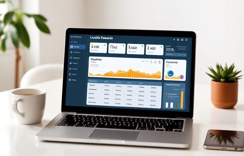
You've built a loyalty program. But if customers can't easily see how many points they have, how close they are to their next reward, and what's available to them right now — your program is invisible. The loyalty dashboard is where your program either becomes a daily engagement tool or a forgotten account setting. Getting it right is one of the highest-leverage UX decisions you'll make in your loyalty program design.
Build a loyalty program your customers will actually use
See Loop.fans Loyalty & RewardsWhat Customers Actually Want to See
Want to calculate the ROI of a loyalty program? Try our free loyalty ROI calculator — See the revenue impact in minutes.
Loyalty dashboard research consistently reveals the same customer priorities. For more on this, see our guide to customer lifetime value formula. In order of importance:
- Current points balance — immediately visible on dashboard launch, prominently displayed
- Progress to next reward — the most motivating display; a progress bar showing how close they are to something
- Available rewards right now — what can they get today? If they can redeem, show them how
- Recent earning activity — what did they earn recently? Reinforces positive association with earning actions
- Tier status — current tier and requirements for next tier
Secondary features that add value: referral dashboard, challenges and missions, community feed, exclusive content access. For more on this, see our guide to customer retention software. These belong one navigation tap away — not on the primary screen.
The mistake most brands make is cluttering the primary view with secondary features while burying the points balance. For more on this, see our guide to loyalty program ideas. Every second a customer spends looking for their balance is a second they're considering whether this program is worth engaging with.
The Progress Bar: Your Most Powerful Loyalty UI Element
Nothing in loyalty dashboard UX drives behavior as consistently as a well-designed progress bar. The psychological mechanic is called "goal gradient effect" — the closer people are to completing a goal, the more motivated they become to complete it. A customer who is 50 points away from their next reward is more likely to make an incremental purchase than one who is 500 points away, even if the reward is the same.
Implementing this effectively:
- Show the progress bar prominently, above the fold on every dashboard view
- Frame it as "X points until your next reward" not "Y points earned" — forward-looking framing outperforms backward-looking framing
- Make the bar color-change as it fills — visual feedback that progress is happening
- When a customer is close to a reward, send a notification: "You're 50 points from Gold — here's how to get there today"
Transparency Builds Trust (and Drives Engagement)
A common loyalty program failure mode: customers earn points but don't understand how the math works. They can't figure out what their points are worth, when they expire, or how many they need for which rewards. Confusion leads to disengagement — not because the program is bad, but because it's opaque.
Design for radical transparency:
- Clear exchange rate: "100 points = $5 off. Your current balance is worth $X." Customers should be able to instantly calculate their reward value.
- Expiration visibility: if points expire, show the expiration date prominently and send advance warnings. Customers who lose points to expiration feel burned and disengage.
- Earning history: a clear record of every action that earned points, with the amount earned and the date. Customers who can trace their earnings trust the program more.
- Redemption history: past redemptions visible alongside future reward options. Completing a redemption loop reinforces the program's value.
Mobile-First Is Non-Negotiable
More than 60% of loyalty program interactions happen on mobile devices. If your loyalty dashboard is designed desktop-first and then scaled down, the mobile experience will inevitably be compromised. The reverse approach — design mobile-first, then adapt for desktop — consistently produces better loyalty dashboards.
Mobile-first design principles for loyalty dashboards:
- Thumb-friendly tap targets (minimum 44px × 44px for all interactive elements)
- Critical information above the fold without scrolling on a standard phone viewport
- Native mobile interactions: swipe for actions, tap-to-expand for details, pull-to-refresh for balance updates
- Fast load time: loyalty dashboards that take more than 2 seconds to load lose a significant portion of sessions before displaying
- Push notification integration: loyalty dashboards that connect to push notifications for milestone alerts keep customers 2–3× more engaged than those relying on email alone
Gamification Elements That Actually Work
Gamification in loyalty dashboards has a mixed track record — done well it drives engagement, done poorly it feels gimmicky and condescending. The gamification elements with the strongest evidence:
Achievement Badges
Milestone markers for specific behaviors: first referral, 10th purchase, 1-year anniversary, product review submitted. Badges work because they create a collection psychology — customers feel motivated to complete sets — and because they provide a visible history of their relationship with the brand. Display badges prominently in the profile section of the dashboard.
Tier Progress Visualization
A visual representation of tier journey (Bronze → Silver → Gold → Platinum) with clear indication of current position and distance to next tier. The tier map should make the journey feel achievable — customers should be able to see themselves reaching the next tier within a reasonable time horizon at their current purchase frequency.
Streaks and Consistency Rewards
Reward customers for consistent engagement over time: "5 purchases in 5 months — earn 200 bonus points." Streaks work particularly well for high-frequency purchase categories (coffee, beauty, supplements) where the natural behavior is regular and the streak reinforces the habit.
Leaderboards (Use Carefully)
Community leaderboards showing top earners can drive competitive engagement among your most active customers. But they can also alienate customers who feel they can never compete. Use opt-in leaderboards, or limit them to specific challenges rather than overall program standing.
Free loyalty program — no app download needed for customers
See Loop.fans Loyalty & RewardsThe Reward Discovery Experience
Customers who can't easily find and understand available rewards are less likely to redeem — and lower redemption rates are actually a loyalty program health problem. When customers never redeem, they don't experience the program's value. Design your reward catalog for discoverability:
- Prominently display rewards the customer can access right now with their current balance
- Use visual previews (product images, experience imagery) rather than text descriptions alone
- Sort by "closest to unlock" to show customers what's almost in reach
- Filter by category: products, discounts, experiences, charitable donations
- Include a "worth it" indicator: estimated value relative to points cost helps customers make redemption decisions
Building Your Loyalty Dashboard With LoopFans
LoopFans provides mobile-first loyalty dashboards with built-in progress tracking, achievement systems, referral dashboards, reward catalogs, and community features — all configurable to your brand without custom development. Explore LoopFans to see how your loyalty program can look and work for customers.